Photobox Design System
PhotoBox is Europe's leading online digital photo service with over 30 million members.
Challenge
The Photobox Group faced a crucial challenge as they began to build a white label design system to be used across multiple products that carried different features aimed to different cultures/languages.
Top requirement was to keep scaling—how to ship a better digital product, faster, while creating a consistent user experience on every screen.
From design to development process
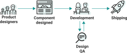
Problem solved
Using a mix of tools and platforms to manage the migration project was making difficult to scale and maintain the design produced at an enterprise level.
To solve for this, we leveraged the power of a comprehensive design system by using a Sketch version control & design workflow management (Abstract) to scale the design consistently.
Allowing the team to collaboratively work on the same files, tracking feedback and changes.
What's into the system?
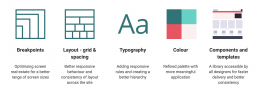
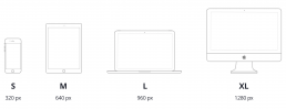
Breakpoints
Optimising screen real-estate for a better range of screen sizes.
Layouts to adjust at each breakpoint and offer an optimal experience regardless of the device / screen the site is accessed from.
The breakpoint work is part of a best-practice overhaul in parallel with the grid work.
Designing at the lowest screen size of each breakpoint to ensure that all screen sizes display the most optimised layout.
Documentation
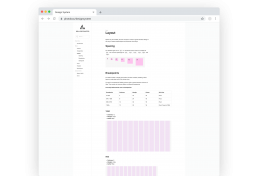
1280px breakpoint
Layout grid spacing
Better responsive behaviour and consistency of layout across the site.
A single grid system has been created, enabling a fluid layout to make best use of any screen size.
There is now a clear page hierarchy and components are consistently aligned resulting in users scrolling further down pages.
A significantly faster design process with defined rules around placement of components on a page, allowing layout to better accommodate translations.
Guidelines for spacing rules
Typography
One font style, Open Sans across all the templates for all brands.
One type scale along with responsive rules has been defined, resulting in a stronger and more consistent type hierarchy allowing customers to read the page better.
Type styles defined within the Abstract pattern library.
Heading tags have been reassigned to benefit SEO.
Typography rules

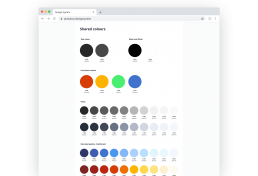
Colours
Refined palette with more meaningful application.
A refined colour palette allowing for a better process of white labelling for other brands. Collaborated closely with Danny and Joanne from engineering. This is yet to be integrated.
Defined rules around colour use.
An easier way to evolve the brand post-migration, improving consistency in use of colour.
Main palette
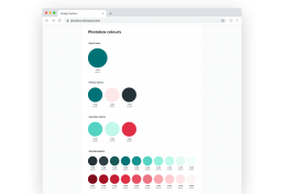
Shared palette
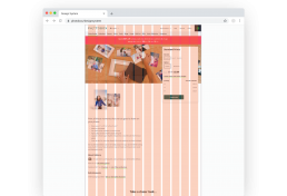
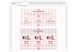
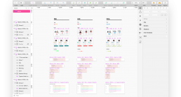
Components and templates
A library accessible by all designers at Photobox Group for faster delivery and better consistency.
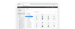
Utilising the Abstract system to create a single source of truth for all elements, components and templates accessible by all designers.
Variants of content layout created for more guidance going forward, resulting in a faster design and build process.
Example of atoms components
Components in use